
Welcome to your roadmap for clearly and consistently representing the Altruist brand. This guide is designed to help you and your team incorporate our visual identity into any relevant materials. Every element—from our logo’s interconnected forms to the warmth of our photography—was thoughtfully crafted to express our belief that the right relationships can build anything. Please follow these guidelines to ensure your communications reflect the maturity, optimism, and humanity of Altruist.
Download Brand Assets
We’ve included a collection of brand assets that you can download to use.
For our Advisors, we’ve also included some helpful branded templates and other materials for use in client communications.


This is the Altruist logo. It is the focal point and instantly recognizable symbol of our brand.
The logo is formally built on the classic qualities of grotesk typography. It brings an impactful and clarifying typographic approach that clarifies boundaries and elevates contrast, proportion and construction.
Metaphorically, the ligatures symbolize the relationships between advisors and their clients, while the tall x-height represents building together towards their financial goals.
The logo has been purposely designed to be bold and confident enough to hold a page with or without accompanying copy or illustration.
Color Combinations
To ensure consistency and readability, the Altruist logo should only be used in black or white. It may be placed in either black or white over a colored background, but it should never be rendered in any color other than black or white.
For more information on the Altruist colors, please refer to the color section of our guidelines.
Clear Space
The clear space zone ensures the legibility and impact of the logo by isolating it from competing visual elements such as text or supporting graphics.
This clear space should be considered as the absolute minimum safe distance. In most cases the logo should be given even more room.
In Use
The following examples illustrate how our logo can be used to express the brand inside and outside of our platform.

Introducing the typographic voice for Altruist, Waldenburg and Oceanic Text. These are the fonts that define our brand and provide familiarity and continuity across our visual expressions.

Waldenburg
Waldenburg is the primary brand typeface for all Altruist branded applications. It’s Normal weight is the inspiration for our wordmark, and should always be present in any form of communication. Waldenburg is an elegantly crafted sans serif typeface, meticulously designed to adapt seamlessly to both analog and digital applications while retaining a warm, print-like quality. It perfectly blends distinctive character with formal neutrality.
Our go-to weight for headlines is the Semi-condensed Heavy weight as it feels impactful and confident while the Normal weight is clarifying and functional in body copy.

Oceanic
Our secondary typeface is Oceanic Text by Interval Type. It is an upright contrast face that strikes a balance between attention-grabbing elements and enduring appeal. Oceanic is a great complement and counterpoint to Waldenburg. The goal in using both these typefaces is to arm ourselves with an extremely versatile typographic voice. While we love it and think it adds to our quiver, it’s still our secondary typeface and should never exceed our use of Waldenburg.
We prefer the lighter weights of Oceanic and specifically Book. It feels airy, warm, and friendly, but with a little more presence on the page than Regular. Additional weights should only be used for adding emphasis within text-heavy applications.

Type Heirarchy
When creating communication, this helpful hierarchy diagram provides instruction on each typeface’s role within our type system.
Please note: For the most part, we use Waldenburg Normal for body copy. Depending on the context and tone, we might sometimes use Oceanic Text for longer form content. Serif typefaces are designed for faster and easier reading and creates an editorial tone that feels appropriate for this type of content. See the following page for more information on how to consider tone when selecting from the Altruist font palette.


Here is an overview of the Altruist color palette. Our brand is grounded in our base colors of white and black. The supporting colors can give us impact and vibrancy within our communications.

Tints
Each color has four additional levels of tints—one darker and three that are lighter. Our colors are very bold, and sometimes we’ll want to dial our voice according to the content we’re presenting.
Tints are necessary for all of the various ways we need to show up within our product. They’re also helpful for other applications, such as dividing page content, finding hierarchy within documents and when creating graphic elements such as data visualizations.
Please note: The three darkest swatches on this page are for product accessibility purposes and are not intended to be used within marketing.

Typography
We always set our typography in black or white. This creates consistency, and ensures our communications are always meeting legibility standards. Refer to the next page to determine if you should be using black or white copy. And please note, we never set typography in color.


This section will feature guidance around creating compositions that feel consistently like Altruist.
As you may have noticed, the keyline gesture is a strong graphic representation of our brand that is inspired by the raised bar within our logo.
There are two ways to replicate this gesture within Altruist layouts.
Keyline
The use of keylines in varying weights to define hierarchy of information.
Implied Keyline
The use of typographic elements to create a strong horizontal axis within the composition.

Keyline Weight
We can tell our story of building together through the thickness of the keyline. It also helps us to create hierarchy within our communications.
More weight = more hierarchical importance.
Less weight = less hierarchical importance.

Keyline Structure
Keylines are used for:
A. Keyline: Anchoring a layout
When being simple and direct with our message, we can use 1 thick keyline at the very top to anchor all the elements in a layout.
B. Keyline: Housing content
Our keylines can also house content, be it statements, illustration, photography or data visualization.
C. Keyline: Separating levels of information
We can use different weights of the keyline to create distinction in the hierarchy of elements.

Keyline Examples
From there, we can apply our content: logo, keylines and typography. No matter the application size or orientation, the keyline can suit any of them due to its adaptive nature.

Keyline Examples
And once we have that figured out we can apply other elements, like color and imagery to make impactful layouts that tell stories around our brand and products.


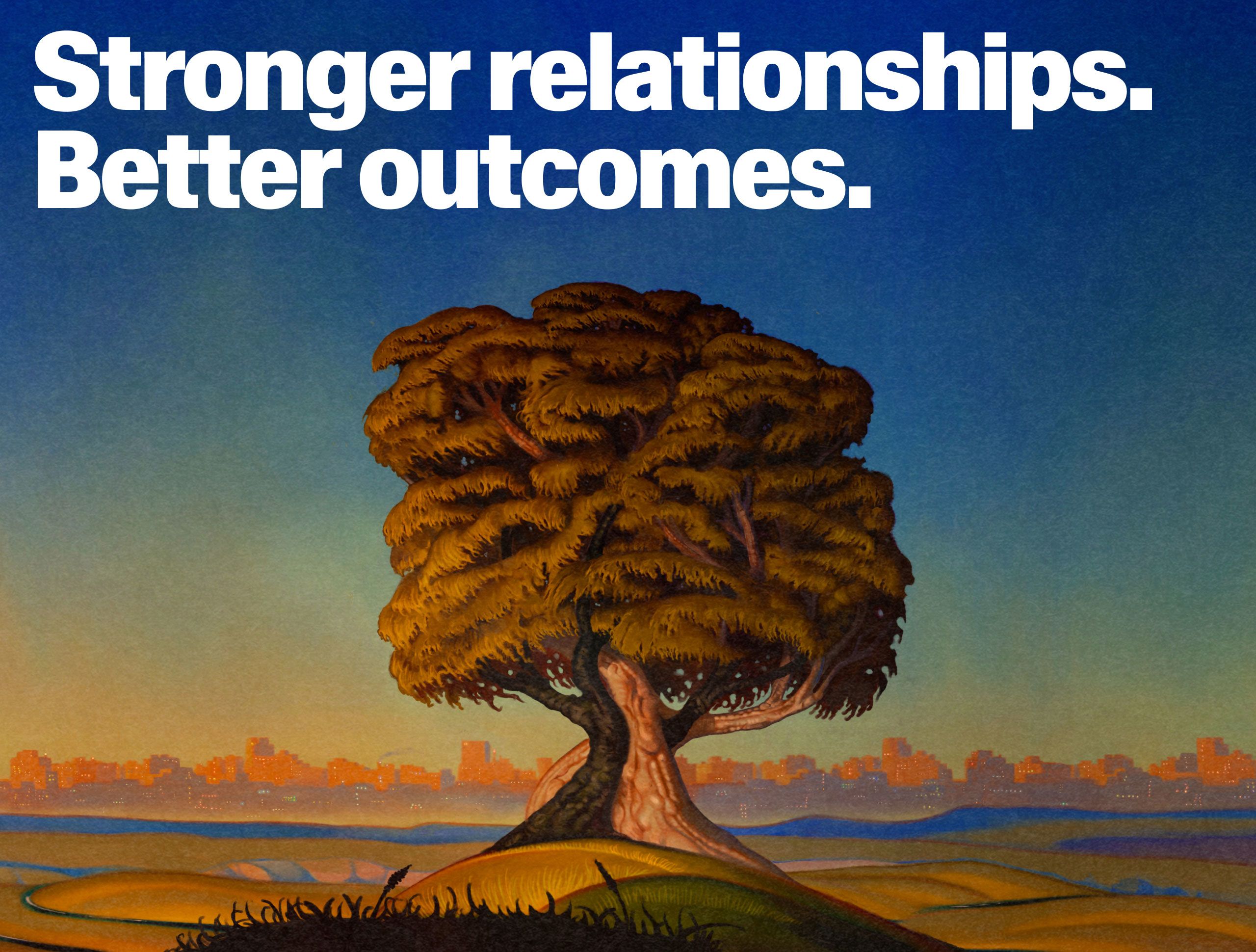
Illustration plays a special role in expressing our brand’s identity, bringing concepts to life with creativity and emotion. Through thoughtfully crafted visuals, we convey complex ideas in a way that feels approachable and engaging, reinforcing our concept of the right relationships can build anything.
Included here are just a few of the custom illustrations we’ve created in collaboration with Dexter Maurer.

Framework
This guide provides a framework for creating illustrations that feel unified in story, theme and expression. It ensures that visuals are not only aesthetically consistent but also conceptually aligned, conveying ideas of connection, progress and possibility.
By focusing on intentional relationships, clear focal points and a cohesive tone, these principles help us to craft visuals that are memorable and impactful. The result is a distinct, recognizable style that tells a compelling story and reflects our brand’s vision.

Library
Included here are more pieces of illustration.


Illustration plays a special role in expressing our brand’s identity, bringing concepts to life with creativity and emotion. Through thoughtfully crafted visuals, we convey complex ideas in a way that feels approachable and engaging, reinforcing our concept of the right relationships can build anything.
Included here are just a few of the custom illustrations we’ve created in collaboration with Dexter Maurer.

The Concept
The overarching behavior that will be driving the sequential behaviors borrows its concept from the main visual concept in which the brand was built—”Rising.”
All of our motion behaviors have a sense of rising up, but they do so in different ways. Each behavior—Together, Sync, Elevate and Flow—possesses unique characteristics and is tailored to fulfill specific purposes based on the context, content and format in which it is applied. Understanding these distinct traits ensures that each behavior is used effectively, aligning seamlessly with its intended goal and context.

Motion Behaviors
Included here are examples of the four key motion behaviors in use: Together, Sync, Elevate, and Flow.
Together

Sync

Elevate

Flow


The following pages will cover what kinds of photography we use, and the stylistic elements that bring them together.
For a full library of licensed images to use, please contact the brand team.

Principles
Photography principles help guide us to ensure our photography feels consistent even when we work with different photographers.
Our principles—Clarifying, Impactful and Intimate—can be interpreted through how we cast our talent; the environments, locations and styling that we create; and how we light, frame and grade our final images. Whenever we need to refresh our photography, we should revisit these principles to help unlock new creative opportunities, as well as ensure our audiences can recognize us within our communications.


This section outlines how we visually represent and extract key features of our products for use in marketing and communications. Our goal is to present product visuals in a way that is clarifying, informative and feels uniquely Altruist, while clearly highlighting functionality and value.
By focusing on specific elements and interactions, we can distill complex features into visuals that are easy to understand and visually engaging, ensuring our audiences can digest how Altruist products are the better choice and can improve their lives. To support these visuals, we created a library of gradients based on our Altruist colors to be used as background elements. They can be scaled, cropped and rotated to make a wide variety of backgrounds for our product visualizations to sit upon.

Extracting
Product Features
in Marketing
When product details are extracted, it can feel a little visually dry, so to ensure we can bring vibrancy and draw eyes to our communications, we use one of our gradient backdrops behind these depictions of our product.
There are subtle but important details we consider when extracting our product to help us look consistently like us. One of those details is that we use a mix of sharp and rounded corners for the holding containers to mimic our logo and our iconography style. For example, if the gradient box is rounded, then the internal screen box is sharp, and vice versa.
The other detail that is important is that we always use a confident and impactful hit of black to create contrast and draw attention to the features and processes that matter.

Product Visualization
Here are more examples of how we visualize the product in dynamic and illustrative ways.

Data Visualization
At Altruist, data visualization is more than design—it’s a tool for clarity, impact and distinction. Our approach reflects two key objectives:
Analytical (In-Product)
Designed to help advisors quickly interpret and act on their data. With bold colors, high contrast and thicker line weights, our visualizations ensure efficiency and precision in every interaction.
Benefits (In-Marketing)
Crafted to captivate and inform, these visuals grab attention, highlight product benefits and amplify messaging with a style that is uniquely Altruist.
By having a style that is functional as well as one that is more graphic and impactful, Altruist’s data visualizations can flex across both product and marketing.

Analytical
(In-Product)
Our Analytical data visualizations are designed for clarity and efficiency, helping advisors quickly interpret data.
Bold Use of Color
Highlights key data points without overwhelming
High Contrast
Ensures readability across all screens.
Thicker Line Weight
Enhances visibility and accessibility.
This approach ensures Altruist visualizations are functional and precise, and bring vibrancy and life to our digital experiences.

Benefits
(In-Marketing)
Our Benefits-led data visualizations aim to captivate and inform, turning insights into impactful stories to resonate with customers.
Impact
Does the visualization grab attention and stand out? Does it have a visual signature that feels uniquely Altruist?
Clarity
Does it clearly communicate the benefits and results of our product? Does it enhance and amplify the accompanying copy?


The Altruist iconography system draws its essence from the brand’s core visual elements: the logo and the Waldenburg typeface. These foundational components share a harmonious blend of round and square edges, embodying a balance that is both modern and timeless.
Altruist iconography strikes a balance between round and square corners to drive distinction and uniqueness and harmonize with design system elements within our product experiences.
This set of applications illustrates various scenarios where the iconography plays a vital role in enhancing visual communication.

Construction
Icon construction should adhere to a 10:10 grid, using it as the boundary for all elements. The stroke weight, represented by the variable ”x”, serves as a foundational measurement. Ideally, the spacing between individual elements within the icon should also equal one ”x”, ensuring visual consistency and balance.
The 10:10 grid is designed to be flexible, allowing for adjustments to achieve optical alignment between different icons. In some cases, strictly adhering to the full 10:10 grid can make certain icons appear larger than others, disrupting visual harmony. To maintain consistency across the set, slight modifications to the grid may be necessary to ensure all icons feel balanced and proportional when viewed together.


Privacy Policy Terms of Service Legal Security IARD Form CRS
Altruist Financial LLC 3030 S La Cienega Blvd Culver City, CA 90232 USA
Altruist Corp (Altruist Corp (“Altruist”) offers technology and tools designed to help financial advisors achieve better outcomes. Advisory services are provided by Altruist LLC, an SEC-registered investment adviser, and brokerage related products and services are provided by Altruist Financial LLC, a member of FINRA/SIPC. Commission-free trading means $0 commission trades placed in brokerage accounts via web or mobile devices. Other fees may still apply. Please see the Altruist Financial Fee Schedule to learn more.
By using this website, you understand the information being presented is provided for informational purposes only and agree to our Terms of Use and Privacy Policy. Nothing in this communication should be construed as an offer, recommendation, or solicitation to buy or sell any security. Additionally, Altruist or its affiliates do not provide tax advice and investors are encouraged to consult with their personal tax advisors.
All investing involves risk, including the possible loss of money you invest, and past performance does not guarantee future performance. Historical returns, expected returns, and probability projections are provided for informational and illustrative purposes, and may not reflect actual future performance. Clearing and custody of securities provided by Altruist Financial LLC.
Check the background of Altruist Financial LLC on FINRA’s BrokerCheck: https://brokercheck.finra.org